Blurry and Wischiwaschi Prints: What Causes Them?
Why this test?
I have seen lots of blurry, foggy, or speckled prints posted on Facebook.
Almost every time, the same question appears:
“What am I doing wrong?”
It seems the answer might be: not that much.
In UV printing, the distance between the print head and the surface is extremely important.
At the same time, the eufyMake E1 height measurement system is extremely sensitive. I even have it in writing now. Well, printed in color on white.
And by extremely sensitive, I mean:
The height measurement detects every tiny crumb.
Once, there was a small scrap of paper on my print bed. The scrap was higher than the object I actually wanted to print on.
The E1 detected it during the height measurement and used it as the highest point. This caused the print head to move higher than necessary.
The result: a blurry print.
So I decided to test it, because I wanted to know:
- What happens with 1 mm more distance?
- At what point does the print become blurry?
- Why does eufyMake recommend a maximum height difference of 2 mm?
- And how much more is still possible?
The test setup
I printed six white test pieces.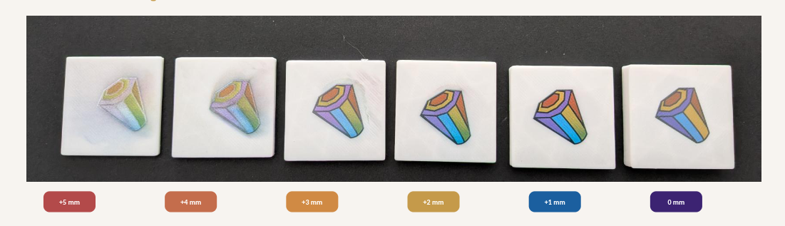
The highest piece is 8 mm high.
Each following piece is 1 mm lower:
| Test piece | Height | Additional distance |
|---|---|---|
| 1 | 8 mm | 0 mm |
| 2 | 7 mm | +1 mm |
| 3 | 6 mm | +2 mm |
| 4 | 5 mm | +3 mm |
| 5 | 4 mm | +4 mm |
| 6 | 3 mm | +5 mm |
The height measurement uses the highest piece as its reference.
That means the print head is positioned correctly for the 8 mm piece. On every lower piece, the ink has to travel another millimeter through the air.
I printed the same image every time. It was a small graphic I found in the software.
CMYK only. No white ink layer.
Why is the distance so important?
The print head fires tiny ink droplets onto the surface.
At the correct distance, their flight path is short.
The droplets land where they are supposed to land.
A dot stays a dot. A line stays a line. The color stays in its place.
When the distance increases, the droplets travel farther through the air.
Then even tiny deviations are enough:
- Droplets drift slightly.
- Fine speckles land next to the image.
- The CMYK colors no longer land exactly on top of each other.
- Outlines become wider.
- Colors look lighter or change.
- A visible color fog appears around the image.
The greater the distance, the more a precise print turns into a cloud of sprayed ink.
What can you see in the test?
0 mm additional distance
- The 8 mm piece is the reference.
- The outlines are clean.
- The colors are strong.
- The image is clear.
- This is how it should look.
1 mm additional distance
- The print is still sharp.
- But the colors already change visibly.
- This is interesting because the print still looks perfectly usable at first glance.
2 mm additional distance
- The result is still usable.
- The outlines become slightly softer.
- The colors no longer look quite as cleanly separated.
- This is roughly the range eufyMake still recommends.
3 mm additional distance
- Now the difference becomes obvious.
- The black lines lose sharpness.
- A light color fog appears around the image.
4 to 5 mm additional distance
- The image becomes visibly blurry.
- The colors look paler.
- The outlines spread apart.
- Fine ink speckles land next to the actual image.
- At this point, the distance is clearly too large.
What about the different colors?
The original test image already contains different colors.
Orange, yellow, green, blue, and violet are already different in the graphic. The larger distance did not create those color differences.
I will come back to ICC profiles and how to use them later. For this distance test, they are not the main issue.
What matters here is comparing the same color across all test pieces.
You can see that:
- The color tones change.
- Saturation decreases.
- The colors mix differently.
- The outlines become increasingly messy.
The test was also printed using CMYK only.
The original image is displayed on a screen in RGB. RGB can show much brighter colors than CMYK.
That is why even the cleanest print does not look exactly like the file on the screen.
That is normal and is not directly related to this distance test.
Why does eufyMake say 2 mm?
The 2 mm limit is not magic.
At 1.9 mm, everything is not suddenly perfect. And at 2.1 mm, everything does not suddenly break.
It is a sensible tolerance range.
With an additional height difference of around 2 mm, the print usually remains usable.
Beyond that, blur, color shifts, and ink fog become increasingly obvious.
But my test also shows:
Even 1 mm can already be visible.
Not necessarily in the sharpness straight away, but definitely in the colors.
Conclusion
The distance to the print head is important.
Very important.
When your print looks blurry, pale, or speckled, it does not automatically mean the file is bad or the print head is broken.
Often, the measured height is simply wrong.
A tiny crumb can be enough.
Or your blank may have a raised edge, a curve, or a recessed printing area.
The E1 measures the highest point. If the actual printing surface is lower, the machine prints from too far away.
When the distance is wrong, even a perfect image cannot be printed cleanly.
Before printing, always:
- Check the print bed
- Remove crumbs
- Clean the surface
- Watch out for objects with different heights
- Keep the height difference below 2 mm whenever possible
Unless, of course, you deliberately want to create a soft, washed-out effect.
Then simply place a higher object next to the actual printing surface and use it to change the height measurement. ;)
And there you have it:
Wischiwaschi by Design
Of course, only in a controlled way and with enough clearance, so the print head cannot hit anything.